


We’d like to share some exciting news for the new year from Just Hospitality – We have rebranded to Fooditude!
Over the past 6 months our marketing team has been working with Colt, a design agency that specialises in branding and identity. They’ve worked with some big names like BT and Adidas but they also have experience in hospitality from hotels to restaurants. Their remit was to audit the Just Hospitality brand, improve the good bits, get rid of the bad, and create a brand that represented what Just Hospitality was trying to achieve as a business.
We took out extensive research with our clients to better understand what they thought about our name, our brand, and if Just Hospitality was an accurate representation of the company they knew. The overwhelming consensus was that our brand needed an update and that it did not match the breadth of our services. More importantly, the research made clear that a rebrand would not affect our working relationships with all our valued clients.
Encouraged by the research we embarked on a renaming and rebranding exercise that has culminated in a brand that we feel truly reflects our personality as a company and the services we offer.
So, without further ado, we’d like you to meet Fooditude!
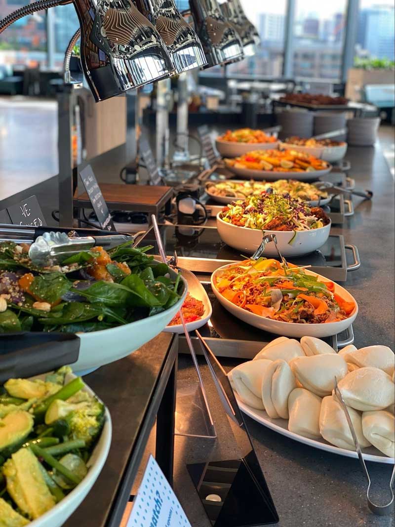
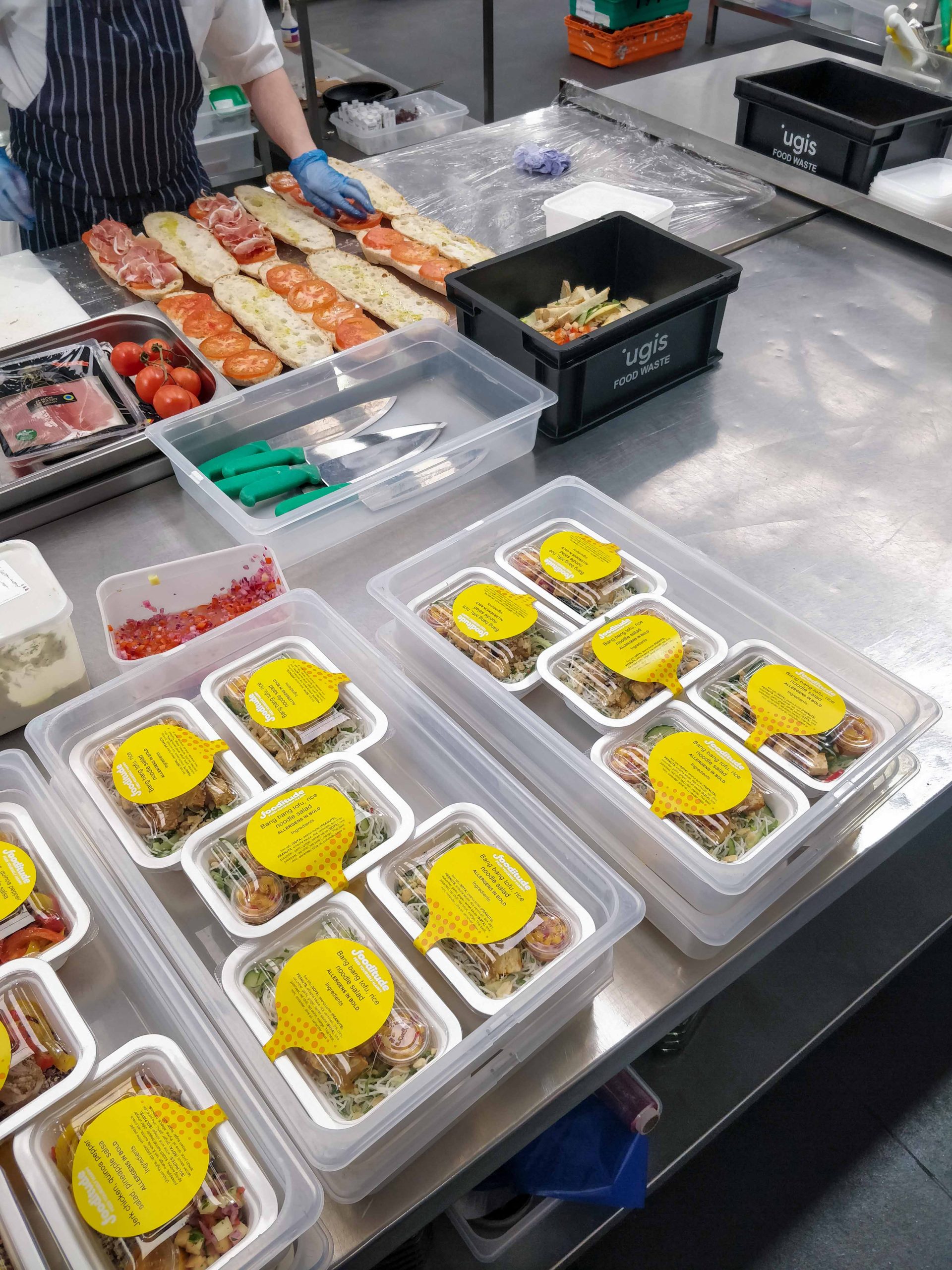
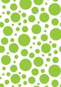
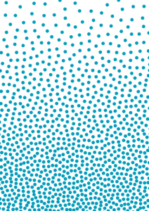
Our new visual identity uses a bright colour palette, bold illustrations and striking patterns to characterise the brand as cheerful, self-assured and authentic. Our emphasis on bringing happiness into the workplace is reflected in the new tagline “Feed yourself happy”. We define the name as an individual or collective with a passion for creating healthy food that provides people with joy. This language speaks to Fooditude’s belief that in the fast-paced London food delivery market, we are well-placed to cater for any business that understands the value of good food for inspiring and rewarding their staff.


The brand officially launches in the New Year. That means as of 1st January 2019, everything you see in the public that was once Just Hospitality will be rebranded to Fooditude. Our website and social channels go live on the same day – check out www.fooditude.co.uk or @WeAreFooditude on Twitter and Instagram.
Join us on this journey to feed yourself happy!